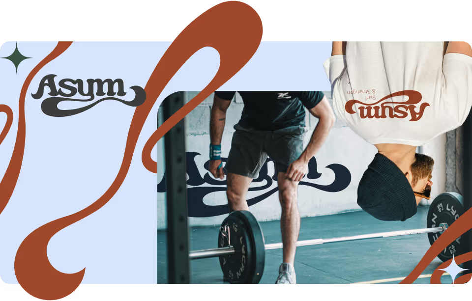
Asym is a strength and conditioning service that specializes in addressing the asymmetrical demands that surfing puts on the body. I created the visual identity to reflect the core elements of the business: asymmetry, human anatomy, and surf culture. The project included the creation of comprehensive brand guidelines, featuring a unique color palette, typographic system, and supporting graphic elements that reflected the brand’s balance of strength, flow, and precision. I also collaborated closely with the business to establish a strategy for implementing these assets across digital and physical touchpoints, ensuring consistency and cohesion as the brand grows.
Branding
Brand Consulting
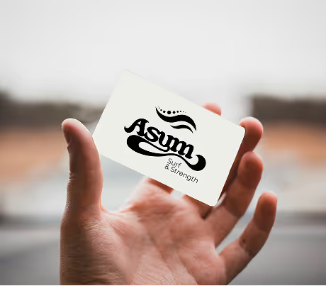
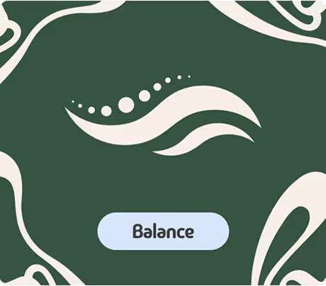
The logomark uses basic geometric shapes to convey its message. Clearly meant to resemble waves, it also uses circles to mirror vertebrae in the spine. It encapsulates the fluidity of the ocean and the asymmetry of human anatomy. The logotype was hand-drawn to expand on that fluidity and solidify the surfing core of the brand.

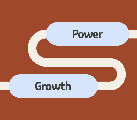
The color palette pulls influence from nature. The three main colors represent earth, fire, and water. The soft-white and the charcoal-black are used to round out the naturalistic feel of the palette.

Breg, an orthopedic bracing manufacturer, had an issue with the clarity of information and user experience on their website. The...
View Project
Dotmatics, a leading science and technology company, needed a video for an upcoming trade show. The goal was to take complex...
View Project